
•
Storytelling with Data: 5 Steps from Raw Numbers to Real Insights
You’re sitting in your office, staring at multiple dashboards, spreadsheets, and reports from different systems—sales data in one place, marketing metrics in another, customer feedback buried somewhere else. You’ve got numbers, charts, and graphs, but what you really need is a clear answer: What’s working, what isn’t, and what should we do next?
Many businesses are sitting on a goldmine of data but struggle to turn it into something meaningful—something that guides decisions and incites action. That’s where storytelling with data comes in, helping you transform scattered information into a clear, compelling narrative that allows you to make confident business moves.
In this article, we’ll break down how to turn those raw numbers into real insights, diving into:
- What is data storytelling (and why does it matter)?
- Steps to transforming data into insights
- How Power Platform supports these steps
- Practical use cases for data storytelling
What is Data Storytelling ?
And Why Does It Matter?
Data storytelling creates a narrative that transforms numbers into knowledge. It combines data, visuals, and context to reveal actionable insights.
Good data storytelling connects the dots between what happened, why it happened, and what you should do next,” says Patricia Harty, Analytics Consultant at Convverge. “It’s about making the information your business already has access to meaningful and actionable.
Research shows that businesses investing in data and analytics experience a profitability or performance increase of at least 11%. This boost comes from the ability to make faster, data-driven decisions, identify new opportunities, and respond proactively to challenges.
Common Challenges with How Businesses Approach Data Today
64% of organizations already manage at least 1 PB of data, and 41% manage at least 500 PB of data. To put that in perspective, 1 petabyte (PB) is equivalent to over 1,000 terabytes or approximately 20 million four-drawer filing cabinets filled with standard printed text. Now, imagine scaling that 500 times—that’s the volume some organizations are managing.
Despite having more data than ever, many businesses struggle to turn it into meaningful insights. The problem often lies not in the data itself, but in how it’s collected, stored, and analyzed. Here are some common challenges that get in the way of effective data storytelling:
1) Overreliance on Spreadsheets
Many organizations still manage certain data types using spreadsheets. While spreadsheets are familiar and great for small sets of data, they’re easy to make mistakes in, hard to scale, and difficult to maintain as data grows. Important insights often get buried in endless rows and columns, making it hard to see the bigger picture.
2) Data Silos Across Departments
Different teams often use different systems to track their work. Finance has one platform, marketing another, and operations something entirely separate. Without integration, data becomes fragmented, and decision-makers miss opportunities because they can’t see the full story.
3) Static, Outdated Reports
Traditional reporting methods, such as monthly static reports, quickly become outdated. By the time the report reaches decision-makers, the business landscape may have already shifted.
4) Inconsistent Data Quality
Think duplicate records, incomplete entries, and conflicting formats. Poor data quality leads to misleading insights.
5) Lack of Data Literacy
Even with the right tools, teams often struggle to interpret the data they see. Without training or support, dashboards and charts can become confusing rather than insightful.
Data storytelling attempts to solve these challenges, bridging the gap between information and action and making complex insights easier to understand and apply. When data is presented as a clear narrative, decision-making becomes faster and more confident because teams can immediately see what’s happening and why.
Strong data storytelling also promotes better collaboration: when everyone understands the insights, it’s easier to align around shared goals and drive collective action. Most importantly, effective storytelling leads to smarter strategy. It highlights patterns, reveals the reasons behind trends, and provides the context needed to make informed, forward-thinking decisions.
The Three Pillars of Data Storytelling
Every compelling data story is built on three essential elements:
- Data: Accurate, reliable insights that form the foundation of your story.
- Visuals: Clear charts, graphs, and dashboards that make patterns easy to recognize.
- Narrative: Context that explains the insights, highlights trends, and drives decisions. For example, “operational output slowed in Q3” becomes “Output dropped due to an increase in maintenance requests on manufacturing equipment.”
But turning raw this data into actionable insights requires a structured approach. Let’s get into the essential steps that will help make your business data tell a story that drives decisions.
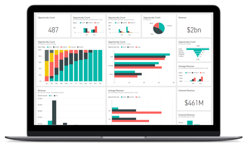
Image source: Microsoft
Steps to Transforming Data into Insights
1) Consolidate Your Data Sources
Great stories come from a complete picture, and that starts with pulling data together from all your systems. Whether it’s financial records, customer feedback, or operational metrics, having everything in one place eliminates guesswork and silos.
You can achieve this by integrating systems or using tools to connect multiple data sources into a centralized data lake or warehouse. But Power BI is just one part of the bigger picture—Microsoft Power Platform provides a seamless way to unify data. With Power Apps, teams can easily capture, update, or delete data, while Power Automate ensures it flows smoothly between systems, eliminating gaps and reducing manual effort. This creates a single source of truth that ensures consistency, accuracy, and accessibility for decision-making.
2) Clean and Prepare Your Data
Raw data often comes with errors, duplicates, or incomplete entries. Without proper cleaning, your story becomes unreliable. Data preparation—removing inaccuracies, standardizing formats, and filling gaps—ensures your insights are trustworthy.
This is where a data warehouse can be invaluable. Instead of manually cleaning raw data every time, businesses use data warehouses to store and structure pre-cleaned, well-organized data from multiple sources.
3) Find the Narrative in Your Data
Now that you have clean, readable data, it’s time to find stories. To do this, focus on business-driven questions such as:
- What trend are we seeing, and when did it start?
- What patterns or anomalies stand out?
- How do these insights connect to our business goals?
Look for cause-and-effect relationships. This step requires curiosity and a willingness to explore “why” behind the numbers.
5) Visualize with Purpose
Great data visualization should make insights easier to understand, not more confusing. Choose charts that match your message: line charts for trends over time, bar charts for comparisons, and heat maps for patterns. Avoid overloading your audience with unnecessary graphics because clarity is key.
If it takes someone longer than 30 seconds to understand what you’re trying to say in your data visual, then it’s not an effective visual.
5) Connect Insights to Action
A good story drives decisions. End your data narrative with a clear recommendation: “Sales are down because of a drop in repeat customers, so we should launch a loyalty program to re-engage them.” Always link insights to actionable next steps, and track how those actions affect outcomes over time.
How Power Platform Supports These Steps
At Convverge, we act as business intelligence advisors and leverage Microsoft Power Platform to help our clients make sense of their data. Power BI, the analytics and visualization tool within this ecosystem, can be used independently or integrated with other Power Platform tools to create a more comprehensive, automated data strategy.
- Power Apps allows businesses to build custom applications that help capture real-time data from frontline teams.
- Power Automate enables automated workflows that clean, structure, and move data between systems, ensuring reports and dashboards always reflect the latest insights.
- Power BI then visualizes and analyzes this structured data, helping organizations make data-driven decisions quickly.
By using Power Platform as a whole, businesses can create a scalable, low-cost, and highly flexible approach to data strategy. Whether you need real-time dashboards, automated reporting, or deeper integration across departments, the Power Platform ensures your data works for you—not the other way around.
Practical Use Cases for Data Storytelling
Let’s make data storytelling feel a bit more concrete. Here are some practical ways you might use it to improve your organization with real-world examples.
Optimizing Operational Efficiency: By analyzing patterns in workflows, resource usage, and logistics, you can identify opportunities to streamline operations and reduce costs. For example, analyzing GPS tracking and fuel consumption data can uncover inefficient delivery routes. Visualizing route performance may highlight areas for improvement, helping lower transportation costs and reduce delivery times.
Improving Customer Experience: Understanding customer behaviour and service patterns allows you to address pain points and enhance satisfaction. For example, analyzing appointment scheduling trends can reveal gaps in confirmation processes that lead to missed bookings. Addressing these gaps can reduce no-shows and create a smoother customer experience.
Enhancing Production Processes: By connecting data from production outputs, inventory levels, and maintenance logs, you can identify patterns that affect productivity. For example, tracking recurring machine downtimes can help teams schedule proactive maintenance, reducing costly disruptions and increasing overall efficiency.
Boosting Sales and Marketing Performance: Analyzing customer behaviour and purchasing trends can help you design more effective sales strategies and campaigns. For example, a utilities company might analyze energy usage patterns throughout the year to predict peak demand periods. Using these insights, they could offer promotions on energy-saving products before the summer surge, driving sales while helping customers reduce their bills.
These are just a few ways data storytelling can turn raw numbers into meaningful action. Whether you’re streamlining operations, improving customer experiences, or making smarter business decisions, the right data—paired with the right tools—can provide the clarity you need to move forward with confidence.
Ready to Make Your Data Tell a Story?
Storytelling with data turns numbers into knowledge, helping businesses make decisions that drive real impact. By consolidating data, preparing it effectively, finding meaningful narratives, and visualizing insights with clarity, you can move from guesswork to informed action. At Convverge, our business intelligence advisors guide clients through every step of this process, using Power BI to connect systems, uncover insights, and present them in a way that leads to smarter decisions.
The most powerful data stories are the ones that get you into action—and they start with the right tools, strategy, and support. If you’re ready to transform your business data into clear, actionable insights, connect with our team at Convverge to get started.