Home / Blog / Insights / Keep your Power BI Reports Simple Stupid

•
Keep your Power BI Reports Simple Stupid
Power BI is a powerful tool for data visualization and reporting, but it’s important to remember that simpler is better when it comes to creating reports – even more so when those reports drive important business decisions.
Here are some tips on how you can make the most of Power BI and drive better business decisions with your data:
1. Keep it simple stupid
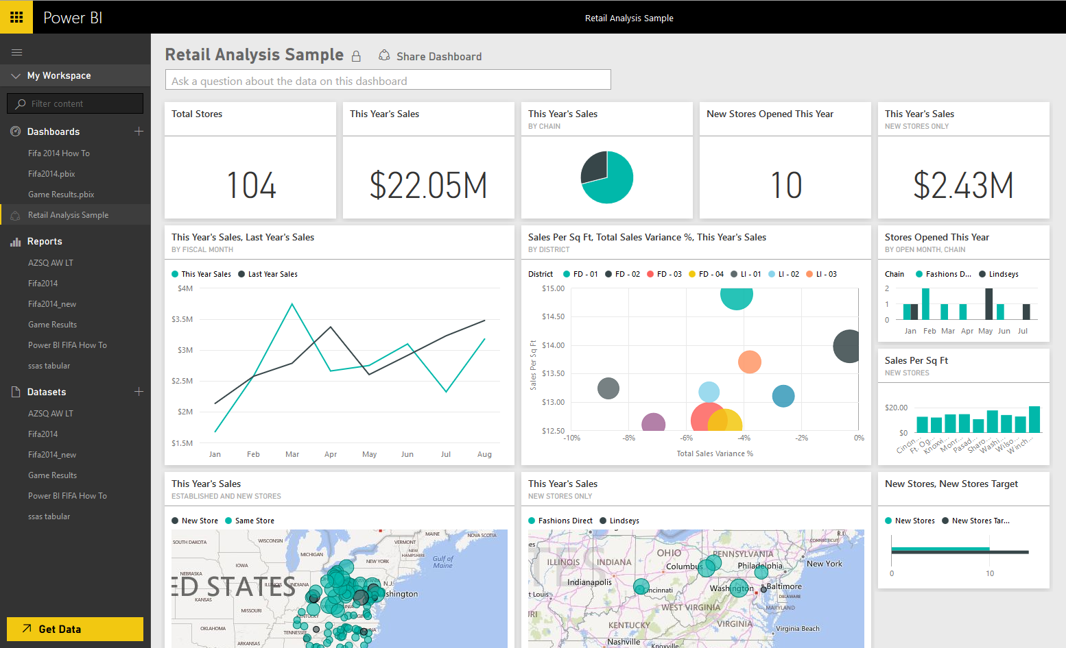
Don’t make assumptions that your audience will be able to fully interpret and understand the data you are presenting. If your Power BI report is cluttered with too much information or complex visualizations, it can be overwhelming and difficult for people to grasp the main points you are trying to convey. Field test your reports with your intended audience, collect their feedback and ensure that readability and interpretation is high on your list of priorities.
2. Simple is faster
Complex Power BI reports take longer to create. They require more resources and expertise. If you truly know what your audience requires, you’ll be able to deliver important information in a succinct and in an understandable format. Don’t get distracted by adding unnecessary elements in an effort to wow people. Keeping your reports simple is doing everyone a favor.
3. Focus on what matters
A simple Power BI report maintains focus on a specific message or set of data points. Rather than trying to say it all in one report, keep one key point as the focus, and build separate reports for others. Just like in conversations, if you say to much in one sentence, your message will be lost in translation. Don’t overwhelm your audience by saying too much and force them to deconstruct your message into a format that they can understand.
4. If it’s efficient, it’s actionable
Simple Power BI reports with clear and concise messages will inspire action. Have a goal and a call to action for your audience. Make their next steps clear. If your report tries to say too much and people have to work to understand to context, chances are high that your message will get lost in translation. Take the extra steps to ensure that your reports make the process of interpreting data easy and actionable.
5. Good design is simple
White space is a good thing. Don’t try to pack too much in. It can be easy to get distracted by the powerful features Power BI has to offer. Embrace the same design and layout methodologies as a graphic designer when composing a Power BI report. How people interpret your data is critical and inconsistencies in seemingly small things like colors, contrast and layout can have a big impact. Take the same approach with reports as a designer would with a website. Understand how the look and feel will impact the user experience and ultimately the translation of your important data. Be sure to keep it on brand too.
Overall, simplicity is key when it comes to creating effective Power BI reports. By focusing on the most important data points, obvious and understandable calls to action, and using clear and concise visualizations, you’ll create reports that are actionable, easy to understand and empower your business to make informed decisions.


